Corporate design for the Berliner Festspiele and the Gropius Bau
Creativity and expressiveness that radiate internationally: MaerzMusik, Theatertreffen, Musikfest Berlin, Jazzfest Berlin and the Treffen junge Szene all come together under the umbrella of the Berliner Festspiele, together with the exhibitions and formats of the Gropius Bau and a diverse programme of guest performances and events. Culture of very different colours, newly formed under the new directorship. This great diversity of offerings, the enormous potential in the interplay between artists and audiences and at the same time the affiliation to the "Berliner Festspiele" family makes 3pc visible with a new overall visual appearance. Together, we have been on a four-year journey towards a new corporate design - with the courage to venture into the unknown.
"Focus, tidy up, reduce courageously"
Under the motto "Focus, tidy up, boldly reduce", the path to something completely new began, reflected in a completely new corporate design. Contemporary and modern art forms, which have created multidisciplinary spaces for experience since 1951 and turned festivals, series and theatres into crowd-pullers, broke new ground. With room for new appearances, for stories, for further development, individual and yet recognisable at first glance as a common brand, as family members.
Finding space together
In future, a completely new corporate design will unite all festivals and theatres under a common festival label - and at the same time reflect the different characters of the individual formats. Such a change of perspective does not happen overnight. With the support of our design team, we will embark on a journey over the next four years that offers room for new expression.
The foundation has been clearly laid in this first season of the journey into the unknown: A design focussed on the essentials ties all the different houses together as an overarching element - and yet leaves plenty of room for continuous change.
What does culture mean, for whom is it there, for whom does it speak - and how will it continue to develop in the exchange between artists and with the audience? For the cultural sector, it is now about more than just continuing what has gone before.

Curtain up for strong characters!
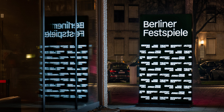
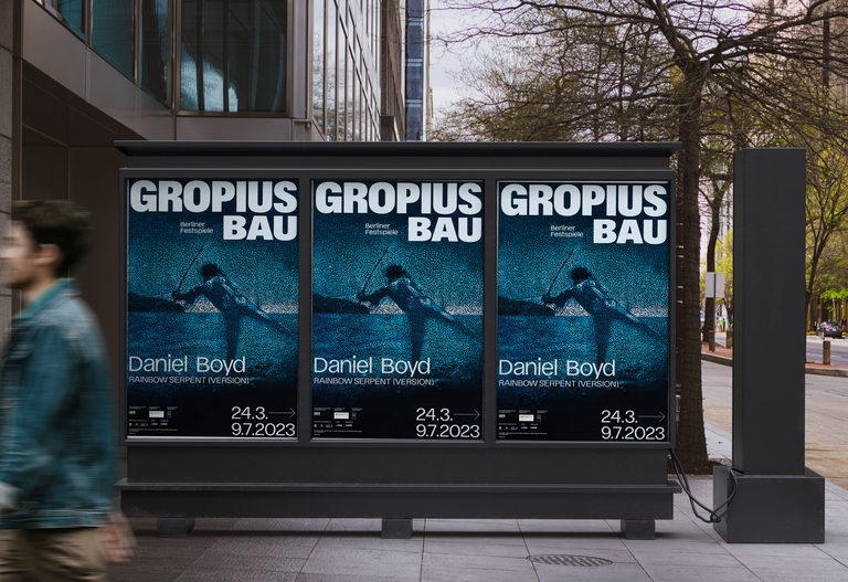
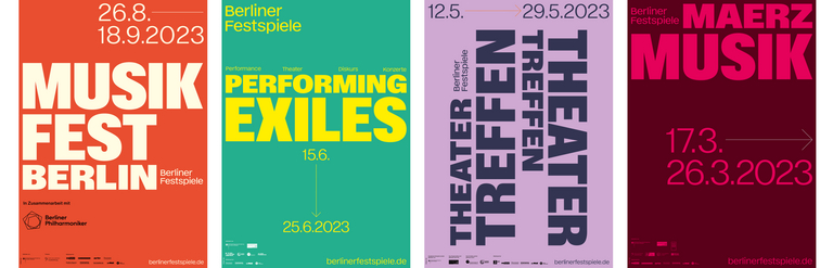
Full of strength and self-confidence, yet open and playful, that's how we are and that's how the festival has started this first season - the first houses, festivals and programmes have taken to the stage with new, purely typographic individual logos.
Each one of them makes a clear and strong statement; in interaction with each other, they display dazzling diversity. And with the lettering "Berliner Festspiele" in their names, they always emphasise their family affiliation despite their independence
Intuitive colour worlds
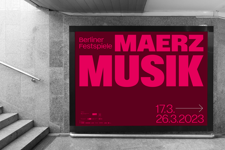
The new logos show presence in their appearance on posters, programmes and websites, all the more so because no other elements distract from them: this year, "only" colours complement the typographic appearance. Each format, each festival presents itself in its own world of colour in addition to its typographic label. The one soft, the other rich in contrast, individually coordinated to make the respective character intuitively recognisable.
Online presence for a family of individuals
The deliberate rejection of the previous focus on the individual houses and festivals brings the joint brand architecture to the fore. Because it is more than the sum of its parts: The renowned individual festival brands can thus strengthen the common umbrella brand of the Berliner Festspiele - and each other - in all their individuality.
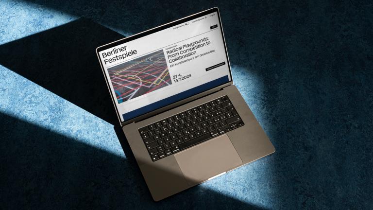
This also becomes very clear when looking at the Berliner Festspiele's new website: The clear design language in the new corporate design offers plenty of scope for the major appearance of all the theatres, festivals and series with their current programme. Together - and yet completely individual.
Thanks to improved accessibility, everyone is invited to join in the experience, and the clear menu structure tempts you to explore further yourself.
This also works in white on black: the website's energy-saving mode can be switched on with a click. Although the site does without visuals and colours in the dark mode developed by us, it remains tidy, typographically very clearly designed and exciting.
An extra feature that saves valuable resources - and will be appreciated by all those who want to continue surfing despite low battery levels.
Think in years - time to grow together
We will visually accompany the Berliner Festspiele for four years - a wide-ranging period with room to grow. For the individual parts of the Festival family to constantly develop. To grow together under the new overall directorship. And for the further development of the external image as well: first of all to get used to and get to know each other again with the current self-confident, open statement of typography and colour.
What comes next? Everything is open! We are looking forward to the next shared worlds of experience - and are keeping our eyes and ears open for an expression, an overall design whose transformation we are helping to shape graphically.

Our part in the journey: Open ears. Listening to what comes. And then find an expression for the new things that find their way to the light. Delicately or as a roaring celebration? We will see.

