Deutsches Institut für Urbanistik gGmbH
Growing structures: makeover and brand realignment

The German Institute of Urban Affairs (Difu) is the largest urban research institute in Germany and deals scientifically and practically with all the tasks that municipalities have to deal with today and in the future. We have redefined the brand orientation in close co-operation with Difu and revised the entire corporate design. Important Difu print publications were also redesigned.
Visibility for science
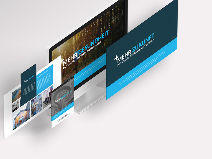
The previous corporate design no longer adequately expressed the relevance of Difu. One of the aims of the new brand orientation was to do justice to the established structures of the renowned institute and to address the various target groups more specifically.
"Difu and decompartmentalisation? That fits!"

Redesign of the brand identity
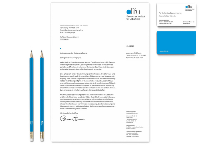
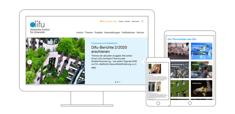
For the new corporate design, we have re-arranged spacing, colour values and typography. The logo and claiming, the complete business equipment as well as important Difu publications such as report series, special publications, flyers, brochures etc. are now modernised and uncomplicated. Thanks to the new corporate design, a stringent appearance is now recognisable on all channels. In doing so, we also took into account an important requirement of Difu: further development while maintaining continuity.


"Positive customer feedback and stronger internal identification: the investment has paid off."
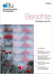
A new look for the Difu magazine
The quarterly magazine Berichte picks up on current topics of relevance to local authorities - new research projects, training reports and events on the topic of cities. With our makeover, this important publication is a real eye-catcher.


"The new layout creates an aesthetic appeal for the scientists at Difu."